Imagine entering a store where everything is cluttered, shelves are mislabeled, and the staff is unhelpful. Frustrating, right? A poorly designed website feels the same way to users. However, websites can turn visitors into loyal customers with a well-thought-out UX Design. In today’s digital world, where every business vies for attention online, standing out is no easy feat.
This is where User Experience (UX) design steps in. UX design isn’t just about making a website look good—it’s about creating seamless, intuitive, and enjoyable user interactions. According to a report, around 88% admitted that they won’t return to a website after facing a bad user experience. By the end of this blog, you will be convinced that better UX leads to superior performance.
The Key Principles of UX Design
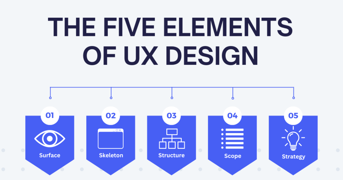
1. Usability:
According to a report, UX design boosts website conversion rates by 400%.
Usability measures the ease with which a specific user can perform a task within a product or service. It encompasses everything from navigation to responsiveness, ensuring the user journey is smooth, predictable, and free of unnecessary friction.
Good usability ensures that:
- Users can perform tasks quickly without confusion.
- Actions are completed accurately and meet their expectations.
- Users feel satisfied with the overall experience.
A food delivery app with good usability, for example, allows users to easily search for restaurants, add items to their cart, and complete the checkout process without hassle. If these steps are overly complicated, users are more likely to abandon the app and switch to competitors.
Here is how you can improve:
To improve usability, usability testing is a vital step in the design process. This involves observing real users as they navigate a product to identify pain points, challenges, and areas for improvement. Here’s how usability testing contributes to better UX:
- By testing with users, designers can uncover navigation problems, confusing layouts, or unclear instructions.
- Feedback from usability testing provides actionable insights for refining the product.
- The goal of usability testing is to eliminate obstacles, ensuring users can complete their tasks effortlessly.
For example, if users in a usability test struggle to find the “Checkout” button on a food delivery app, designers can adjust the layout to make it more prominent. These refinements can significantly enhance the user experience.
2. Maintain consistency:
As per Jakob’s Law, users spend most of their time on other websites or apps, so they naturally expect your product to follow similar patterns. For example, users anticipate that a shopping cart icon will lead to their checkout page. Meeting these expectations enhances the user experience.
Consistency refers to maintaining uniformity in how a product looks, feels, and functions across all pages or screens. This includes:
- Using the same colors, fonts, and button styles across a website or app.
- Keeping interaction patterns similar, so users know what to expect.
- Adhering to a consistent tone and branding that matches the product’s identity—whether professional, playful, or casual.
Here is how you can improve
- Stick to familiar layouts and design elements like search bars or hamburger menus.
- A shared system ensures that designers across the team use consistent components, saving time and effort.
- Design in a way that aligns with how users are accustomed to interacting with similar products.
3. Hierarchy
According to User Guiding, “A well-executed User Interface (UI) design can increase website conversion rates by 200%”
Hierarchy is a key principle of UX design, guiding users through a product or service by organizing and presenting information based on its importance. A well-structured hierarchy ensures users can easily navigate pages, screens, or platforms, allowing them to quickly find the information or actions they need. Without it, users may feel overwhelmed or frustrated, leading to a poor experience.
For example, on a website homepage, a large, bold headline at the top of the page might convey the most critical message, while supporting information appears below in smaller fonts or as bullet points.
There are 2 types of hierarchy in UX design
a. Information architechture:
It organizes how users move from one page or section to another. The goal of information architecture is to make it easy for users to locate the content or tools they need.
It’s Key Features
- Clear Navigation Menus
- Group similar content together.
- Users should be able to move seamlessly from one section to another without dead ends or unnecessary clicks.
b.Visual Hierarchy
It’s about using size, color, placement, and other visual techniques to guide the user’s attention.
- Use larger fonts, bold colors, or prominent placement
- Leverage White Space
- Differentiating between text sizes, colors, or styles makes it clear what’s important.
- Position the most critical information at the top of the page
Here is how you can improve:
- Understand what information users prioritize and structure your design accordingly.
- Stick to conventions users already know, such as navigation menus at the top of the page or clickable logos that lead to the homepage.
- Use usability testing to identify weak points in your hierarchy and refine them based on user feedback.
4. Give User Control
User control is a fundamental principle of UX design that focuses on empowering users to interact with a product or service in a way that feels natural and forgiving. It’s about giving users the ability to correct mistakes, change their minds, or exit a process without frustration.
Mistakes are inevitable, and good UX design ensures that users can easily recover without major setbacks. For instance, allowing users to cancel an action, undo changes, or go back to a previous step can greatly reduce frustration and improve satisfaction.
Here is how you can improve:
- Allow users to reverse actions, such as deleting a file or submitting a form, with simple undo functionality
- Add clear “Cancel” options for processes like checkout or account creation to let users back out without penalty.
- Before executing irreversible actions, like deleting data, show a confirmation message asking users to confirm their intent.
- Enable users to go back to previous steps in a process without losing their progress.
5. Make It Accessible
Accessibility is a fundamental principle of UX design, ensuring that digital products and services are usable by as many people as possible, regardless of physical, sensory, or cognitive abilities.
Accessibility refers to designing systems, websites, and applications that everyone can navigate and interact with, including those with disabilities. Disabilities can be:
Physical: Difficulty using hands or limited mobility.
Visual: Low vision or blindness.
Auditory: Hearing impairments or deafness.
Cognitive/Learning: Dyslexia, ADHD, or other challenges.
Beyond permanent disabilities, accessibility also accounts for temporary or situational challenges. For instance, someone with a broken arm or trying to use a phone in bright sunlight benefits from accessible design principles.
Benefits of Better User Experience

I
1. First Impressions Drive Engagement
A website only has seconds to capture a visitor’s attention, and a sleek, intuitive UX design makes all the difference. Superior UX ensures fast load times, clean layouts, and visually appealing elements, creating a positive first impression. Standard websites often fail here, leaving users frustrated and more likely to bounce.
2. Improved Navigation for Better Usability
Websites with excellent UX are structured to make navigation seamless, helping users find what they need quickly. From intuitive menus to logical information architecture, these sites eliminate confusion. Standard websites, however, may have cluttered layouts or unclear navigation, making users abandon their search.
3. Higher Conversion Rates
Good UX design simplifies user journeys, whether it’s completing a purchase, signing up for a newsletter, or downloading a resource. By removing unnecessary steps and providing clear calls to action, UX-optimized websites can significantly boost conversions. Studies show that websites with superior UX can increase conversion rates by up to 400%.
4. Enhanced Accessibility for a Wider Audience
Accessibility features like high-contrast text, keyboard navigation, and screen reader compatibility enable more users, including those with disabilities, to engage with a website. Websites that prioritize accessibility see better user satisfaction and loyalty compared to standard websites, which often overlook these essential features.
5. Reduced Bounce Rates and Longer Session Durations
Users are more likely to stay and explore websites that feel intuitive and enjoyable to use. Superior UX design encourages engagement, while poorly designed websites lead to higher bounce rates. 88% of users won’t return to a site after a bad experience.
6. Building Trust and Credibility
Websites with polished, consistent designs instill confidence and trust in users. Clean layouts, clear branding, and error-free functionality make users feel secure, whereas poorly designed websites can appear unprofessional or unreliable.
Key Takeaways:
In today’s competitive digital world, UX design is no longer optional—it’s essential. By focusing on key principles like usability, consistency, hierarchy, user control, and accessibility, you can create websites and applications that are intuitive, user-friendly, and inclusive. These principles not only improve user satisfaction but also lead to higher engagement, better conversions, and long-term success.
Remember, great UX is about putting your users first and continuously refining your design based on their needs and feedback. Whether you’re optimizing a food delivery app, an e-commerce store, or a SaaS platform, these principles will help you stand out and build a loyal audience.